Six Charts That Explain This Market from the Sevens Report
The Sevens Report is everything you need to know about the markets, in your inbox before 7am, in 7 minutes or less. Sign up now and get a free two-week trial.
Below you’ll find six charts, spanning asset classes and economic data.
The charts are divided up into two groups.
Group 1 is comprised of four charts that explain why stocks have rallied so nicely in 2017, and why, in the near term, the trend in markets is still higher.
Group 2 is comprised of two charts that look into the future, and show that despite a bullish set up right now, there are real, serious reasons to be worried about how long this rally can last. Point being, these indicators are telling you not to be complacent!
Group 1: Why Stocks Have Rallied
Chart 1: Economic Data
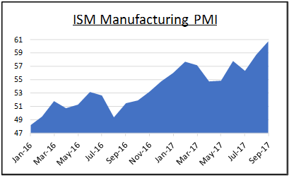
Chart 2: Earnings Growth
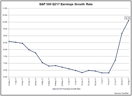
Earnings and Economic Data – The Unsung Heroes of 2017
We have said since the early summer that an acceleration in economic data and earnings growth have been the unsung heroes of the 2017 rally.
And, as long as both of these factors continue to trend higher, that will underpin a continued rise in U.S. stocks, regardless of noise from Washington, North Korea, Russia, etc.
Chart 3: S&P 500
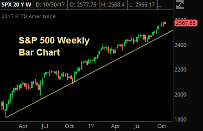
The Trend Is Your Friend
The trend in stocks has been relentlessly higher since early in 2016, and the S&P 500 has held that trend line through multiple tests.
Bottom line, the technical outlook on this market remains powerfully positive.
Chart 4: Commodities (Oil & Copper)
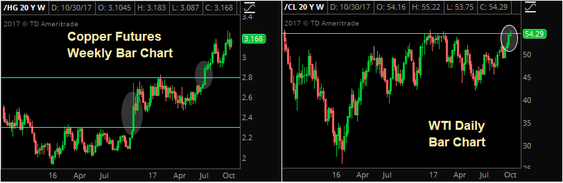
There are few better indicators of global economic growth than industrial commodities, and two or the most important (oil and copper) have been telling us for months that global growth is accelerating.
And, as long as oil and copper are grinding to new highs, that will be a tailwind not just on U.S. stocks, but on global stocks as well.
Group 2: Risks to This Rally
While the four charts above explain why stocks have rallied and why the outlook remains, broadly, positive, there are still risks to this rally and this market.
Don’t be fooled into being complacent with risk management, because while trends in U.S. and economic growth, earnings and the stock market are all still higher, there are warning signs looming on the horizon.
Chart 5: Inflation (Warning Sign #1)
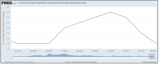
Non-Confirmation: Why Isn’t Inflation Rising?
Inflation remains inexplicably low, considering that we’re near full employment and global economic growth is accelerating.
And, accelerating inflation remains the missing piece of a true “Reflation Rally” that can carry stocks 10%, 15% or even 20% higher over the coming quarters and years.
But, it’s not just about missed opportunity.
The lack of inflation is a big “non-confirmation” signal on this whole 2017 rally, and if we do not see inflation start to rise, and soon, that will be a major warning sign for stocks, because…
Chart 6: The Yield Curve – Will It Invert?
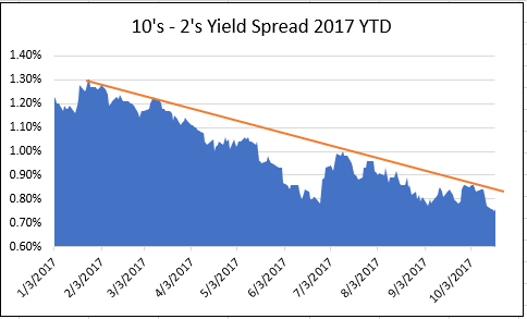
Yield Curve: Sending a Warning Signal?
If the outlook for stocks is so positive, then why did the yield curve (represented here by the 10’s – 2’s Treasury yield spread) equal 2017 lows on Wednesday?
Simply put, if we’re seeing accelerating economic growth, rising earnings, potential tax cuts and all these other positive market events, the yield curve should be steepening, not flattening.
So, if this 10’s – 2’s spread continues to decline, and turns negative (inverts) then that will be a sign that investors need to begin to exit the stock market, because a serious recession is looming, and the Fed won’t have much ammunition to fight it.
If I was stuck on a desert island (with an internet connection and access to my trading accounts of course) and could only have one indicator to watch to tell me when to reduce exposure in the markets, this 10’s – 2’s spread would be it – and it’s not sending positive signals for 2018!